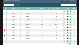
Tables present a lot of info in manageable chunks
But what does this have to do with managing a building? Well, a lot. Integrated systems produce a lot of data. It's all useless unless that information can be gathered then stored and finally presented to the end user in a way that makes it easy to understand. UI and UX informs how the data is presented, for example through charts, tables, icons, notifications. UI/UX creates a structure for how to package that data together, be it by system, by device type, by location, by building type.
The possibilities are endless, which is why it's crucial that your UI/UX team knows what it's doing, and
knows what you're trying to accomplish with the system they're building. Do you want to track alarms? Create and manage schedules? Drill down into individual devices to see which of their sensors are on? Track usage of certain tenant spaces? Bill tenants for energy usage?
The potential for web-based applications that pull data from building controls is truly limitless. That's why good UI/UX is really important.
How to tell a good design when you see it
You probably already know this, but a good best practice to start with is to explore examples of other applications your MSI has created. Have a meeting to discuss what you like and don't like about each example. A bonus would be for you to come to the meeting with one or two examples of an interface you particularly like or dislike from a completely different industry. This opens up the possibilities and can introduce new ideas from the beginning.
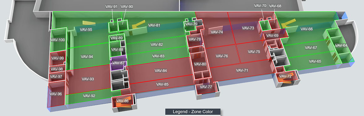
Floor plans provide context to data
On the project road map, build in check points to review progress along the way. This makes it easy to change course if something is misinterpreted or a design isn't working the way it should. Typically you'd start by reviewing static images of 1-3 pages for a general idea of the look and feel of the platform.
Once the application is further on the road to completion, a prototype should be reviewed. This makes the design come to life, by making links clickable so that you can understand how you and your teams will actually navigate through the system.
Consider all the users
At each point during the design process, you and your MSI should be considering all of the system's users. Your MSI will likely discuss user stories at the outset of the project. Good questions at that point are; Who will use the platform? How do the facility manager's needs differ from the property owner's? What is this user's existing workflow and how with this platform change that process? What does this user want to achieve by using the system?
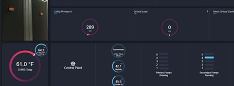
Dashboards simplify info to take in a lot at a glance.
When you're reviewing designs, ask those questions again but in a different way. Are the facility manager's needs being met with this dashboard? Is this workflow intuitive? Consider real scenarios that your users will be confronted with. During your prototype testing, explore how the user would address that issue in the new system.
Train, train, train
No matter how intuitive a design or how thoughtful the UI and UX, sending an email to relevant teams when the application is finished will not make the new system a blockbuster success. Whenever there is a significant change to a workflow or even just a difference of organization in a system, person-to-person introductions to the platform, how to use it and its key features help all users feel more confident using the new system.
These don't need to be one-on-one meetings at each stakeholder's desk. Training videos or live webinars are extremely effective in providing opportunities for users to get comfortable with a new platform. Recordings also provide an archive of information so that users can refer back if they encounter a problem or question later on.